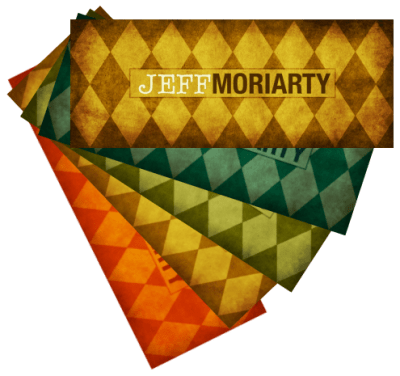
 In my meandering exploration of this whole idea of personal branding, I decided it was past time to get some personal cards. “Business cards” doesn’t quite cover it, since I’m not exactly an “all business” kind of fellow. I was inspired (again) by Tomas Carrillo and his new Moo cards, but my creative talents are in a very different arena than what was needed here.
So I turned to the very talented Luz Galusha-Luna for some help. She is yet one more in the army of amazingly talented people I’ve met through Twitter and the related stomping grounds. We shot back and forth a few ideas, and the results are what your peepers are now feasting upon.
The different fonts for my first and last name were Luz’s idea, and intended to capture both the playful and professional parts of my personality. I asked for a nice, simple pattern on the front, and she came up with this wonderful, mildly-retro looking pattern… and in a gorgeous selection of colors.¬† I told you she was talented.
I struggled with what to put on the back, not wanting to turn it into a full resume. I went with my phone, email, and twitter account to cover the basics. My LinkedIn, Facebook, and websites are easy enough to find with a little help from Mr. Google.  Beyond that I just went with a few keywords: creative, technical, passionate, writer, developer, igniter, explorer, inventive, high in fiber.
Most of those are self-explanatory. “high in fiber” you can take in a number of ways, and I think they all apply.
I had the cards printed by Moo, and absolutely love them. Good quality and fairly inexpensive, so now I always have plenty to give away at Ignite, lunch, or whenever I make a new connection. If you’re thinking about making any cards up for yourself I highly recommend both Luz and Moo to make something that is distinctly you.
Jeff – your cards are a perfect reflection of you! Creative, colorful & concise. Very nice!
Nice. I was thinking of doing the same to give out in my cab!
@CWaterhouse – Thank you! Again, all praise to Luz for her amazing work. It shows how good design is more than fonts and colors, but about really understanding the medium.
@AzBryan – These would be perfect for that. People remember them, they catch the eye, and they’re not very expensive.
Aww! Thanks, Jeff! It was fun making them and I’m glad you like them!
A harlequin pattern is so right for you 🙂
I love the design. Nicely done! Thanks for sharing this with me.